31 July 2011

Three wishes for Gold Notes’ next 12 months

I’ve had great fun working on Gold Notes these past three years, and sharing “threesomes” with you throughout this July anniversary month. This post marks my 150th -- woo hoo!

I’ve especially enjoyed and appreciated the many guest posts by friends from across the blogosphere. Thank you, Arne Salvesen, Becky Shankle, Allan Dallatorre, La Jolla Mom, Debbie Schaeffer and Bob Borson.

I’ll continue working on Gold Notes going forward, keeping as close to my regular weekly posting schedule as possible and bringing you as much timely design information as I can. That is sometimes a challenge, given other demands on my time and achieving that rare work/life balance we all aspire to. (Thank heavens for Blogger's scheduling feature, which I only figured out how to use this season!)

My first wish for Gold Notes’ next year is including even more guest posts. Regular readers already know my Sensible Style point of view. I think it benefits all of us to get insights from others with knowledge beyond my scope.

For example, last month I brought you a terrific guest post on outdoor kitchens by the pros at Kalamazoo Outdoor Gourmet. This was not an advertisement for their brand – Gold Notes hasn’t accepted advertising to date – but great suggestions from a leading industry source. My own experience with outdoor kitchens is limited. Theirs certainly isn’t, so we all gain from the info.

In Gold Notes' past three years of publishing, I've also brought you lighting tips from Vicky Lodge, technology insight from David Van Wert, appliance expertise by Julie Warner and so many more! Thank you all!!!


My second wish for Gold Notes’ next year is to increase my readership. It’s already grown considerably since its launch in July 2008 and I thank you for that. I’d like to grow it even more in the next 12 months, which is where you come in. Please let me know what types of posts you’d like to see here, or send me questions you’d like me to answer online. If you value the information I’m including, please also share it with anyone you know who would also benefit from reading it, or share it on the social networking sites you use, linked below. Thank you.


My third wish, and this may be beyond 2012, given other commitments on my calendar -- including a kitchen idea book I'm writing for Taunton -- I’d like to see my Sensible Style series, launched in partnership with Kitchens.com in 2009, collected into a book. I would include added-value content, like bathroom information not currently online, useful checklists and industry resources, that I believe will be of value to those seeking to update their homes in these challenging times.


Thank you, contributors and readers alike, for helping make Gold Notes a regular read for design enthusiasts.



Jamie Goldberg, AKBD, CAPS
JAMIE GOLDBERG KITCHEN AND BATH DESIGN

San Diego, CA

29 July 2011

Guest post by the Kitchen Mogul: Three favorites from the UK

Last January, I had the opportunity to visit my first European kitchen show and it was a revelation! There were so many styles, trends and technologies that we don’t yet have in the States.

That got me thinking that a thrilling “threesome” could come from a blogger from “across the pond.” Happily, the Kitchen Mogul agreed to be that voice from afar. Here are his favorite UK trends this season.


Shelves and voids

Uniform lines and clinical finishes are not as interesting as they used to be so, increasingly, European kitchens have become riddled with nooks and voids. These open spaces create aesthetic interest for the viewer and help layer the design.

The use of open shelving has also been influential in blurring the boundaries between kitchen and living space, allowing the kitchen to become personalised with familiar objects and photos. These elements dilute the kitchen look and allow the user to introduce sentiment into the environment and establish personal comfort within this functional space.


An Ewe Kitchen


The Contemporary Classic Kitchen


In ancient times, conflict between two opposing kingdoms was resolved though personal union; you know how the story goes! So it is interesting to see the emergence of the Contemporary Classic Kitchen. This hybrid design embraces the precise lines and asymmetrical geometry of contemporary kitchen design, but also harnesses the warmth and longevity of traditional textures and door profiles. This particular concept helps to resolve the age old predicament of having a trendy kitchen for now that will provide fashionable reassurance into the future. The Mogul predicts that this will become an increasingly powerful trend!


An MVK Italia Kitchen


The Shape Shifter

The modern kitchen has been released from its architectural confines and has now been accepted as the functional centre piece of our homes. With the popularity of open plan living, it is important that the modern kitchen displays versatility, allowing the user to physically and emotionally interact with the space.

The level of transformation can be quite extreme, with some designs coming complete with fully-automated moving parts to move the kitchen from a standby to an in-use position. Other methods are quite subtle with designers using only lighting to change how the kitchen is perceived. Having the ability to shift between states of use can help to enhance the surrounding architecture and add to the overall users experience.


A Linea Quattro kitchen

27 July 2011

Guest post by Veronika Miller: Three favorite Modenus catalog products

I hope you’ve been enjoying all of these Gold Notes’ “threesomes,” especially the brilliant guest posts! Here’s the latest, contributed by design maven Veronika Miller of Modenus.

This extravagantly delicious site is Designer Central on the Internet, a forum for professionals, manufacturers and design enthusiasts. It shares ideas and inspirations, products and resources. If you haven’t visited yet, go there next!

First, though, please enjoy Veronika’s three favorite products on Modenus.

***

I never wanted Modenus to be a one-size-fits-all solution, so we decided early on to curate our collection. As a result, we now have a budding collection of more than 5,000 products that we love and can wholeheartedly endorse, usually because of the product's aesthetics, but sometimes because we like the mission or vision of a manufacturer or designer.

So along comes my dear Twitter friend, Jamie, asking for Modenus' three all-time favorite products, which honestly has me squirming, since all the products we showcase are there because my staff and I love them. But OK, Jamie, consider yourself indulged. Here are three personal favorites that made me do a double take... To the other 5184 products, we love you, too.

Three favorites in no particular order:

Jamie Beckwith Flooring Collection – Sextant pattern


I love the Moorish influence in this pattern and and the deeply saturated finishes Jamie Beckwith works with for all of her designs. I want to add that this is an example where I love the product and the story of the spirited woman behind the designs. Jamie's interiors are just as stunning.


Artistic Tile – Ambra Collection


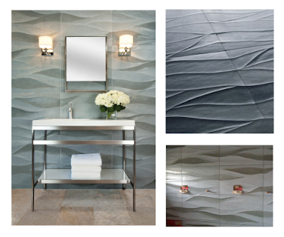
Aside from simply being a gorgeous pattern, I love the craftsmanship that goes into this highly sculptural pattern that creates the impression of two different colored stones when really it's one stone alternating polished and honed. Artistic's collections are ones I love to see at trade shows because I'm a very tactile person and these have to be touched as well as seen.


Zia Priven Lighting – Solano Pendant


An iconic shape that works in so many different settings, it's perfect for those homes I plan to buy right after I get that extra million. I love Marcia Zia-Priven and Paul Priven for their incredible design sense, their pursuit of perfection in craftsmanship and because they've managed to remain down to earth and altogether cool people in spite of success and fame.

I think I will now have to go back to Modenus Blog and re-visit several other amazing product lines I've just come across as I was researching these favorites. Tough project, Jamie but thanks for the opportunity, as it reminded me once again why I love my job.

25 July 2011

Guest post by La Jolla Mom: Three favorite kid-friendly kitchen items

In honor of Gold Notes’ third anniversary, I asked uber mommy blogger, Katie Dillon, best known as La Jolla Mom, to share her three favorite kid-friendly kitchen items. I’m thrilled that she said yes, especially as so many of my readers are moms themselves. I hope her insights help you make your kitchen more family-friendly.

***

Plans to renovate our kitchen accelerated once I found out I was pregnant. We had a hard deadline to finish it all before my daughter was born, so major decisions were made at a nerve-wracking pace. We enlisted the help of professionals, and are thrilled with the results. However, though I didn't know it at the time, a few choices proved invaluable as a parent.

Brizo Pascal faucet


I originally chose this Brizo Pascal Faucet for sanitary reasons. I envisioned myself cutting up raw meat and not wanting to touch the handle of my faucet, sanitize it, and repeat during the course of preparing a meal. The spout is positioned so that I can easily tap it with my elbow to use water. There is also a completely hands-free feature, which operates the faucet by simply sensing my hands are underneath the spout.

As a new mother, I could hold my baby and turn the faucet on without awkwardly reaching over the sink. It was easier to perform tasks such as washing my hands or wetting towels to mop spit up and other spills. As she became heavier, I appreciated this faucet even more. Now that my daughter is four years old, she can tap the faucet herself to turn it on and off. Even with a step stool, she can't reach the handle. Preschoolers are constantly washing their hands, so not having to turn the water on and off for her multiple times per day is definitely useful.


Sub-Zero Model 695 Refrigerator


As we have a water dispenser on our sink, I almost opted for the Sub-Zero refrigerator without a water and ice dispenser in the door. I'm so glad I didn't, because the water tastes noticeably better than our filtered sink water, (probably because it's cold). We now keep a stack of kid-friendly cups next to the refrigerator for my four-year-old to help herself to water, since she can't reach the levers on our sink without a big step stool.

She used to dislike water and beg for juice instead. Now, she drinks almost exclusively water because she likes operating the water dispenser all by herself. The other aspect of the refrigerator that I appreciated when she was younger is that the doors are heavy and the seal is tight. During the nosy toddler period, she could never open the doors.


Little Partners' Learning Tower


I purchased the Little Partners' Learning Tower when my daughter was just past two years old. It still lives next to our kitchen island, where we do most food preparation, and I believe it will stay there for years to come. I can't recommend the Learning Tower enough, if you have the space for it. It has adjustable heights so kids stay at counter level as they grow. If kids can't see what you're doing on the counter, you may have them tugging at your pant leg and fussing instead.

While standing in the tower, my daughter has snacks, does crafts, and is happy to just hang out while I'm preparing meals. It has given me freedom and is partially responsible for my daughter's genuine interest in cooking.

22 July 2011

Guest post by Bob Borson: Three favorite wood species

I'm having a tremendous time compiling my "threesome" series for Gold Notes' third anniversary this month. I hope you are, too! I've asked many of my industry friends to contribute their thoughts and am positively thrilled that so many have said yes.

This latest one is by the delightful Bob Borson, architect, blogger and all-around raconteur. Bob's Life of an Architect blog is as engaging as it is brilliant. Here he shares his three favorite wood types. Two of them happen to be mine, as well!

***

When I was asked to contribute to Jamie’s series on “Three Favorite …” I said yes immediately, even though I knew that I would have a hard time coming up with my three favorite anything. I fall squarely into the camp that thinks the better the problem, the better the solution. Having carte blanche to pick whatever I want to focus on is just about the hardest thing someone could ask from me... Three Favorite Buildings? Three Favorite Architects? Three Favorite Cities?

Ughhhh … it’s too hard for me to select an answer to any of these questions. As a result, this post has sat empty for the last two weeks as I beat myself up trying to respond to my friend’s request. Then it hit me – literally. Arriving in the mail this last Friday were samples I had ordered from one of my wood vendors of three different wood species. Did someone say three?

In no particular order of preference:

Walnut is, for some reason unknown to me, the one species of wood that is associated with modern style architecture and design. The difference between the lighter brown summer growth and the much darker bands of winter growth give this wood an extremely pleasing striation. The walnut tree can reach up to 130 feet tall, which provides for some large veneers – making walnut an excellent choice for paneling and cabinetry.


White Oak is native in many parts of the United States, one of them being East Texas. Since my architectural practice is based out of Dallas, this is a very cost effective and readily available wood species. Of the three listed here, I probably use rift cut white oak the most often because it fits into the soft modern aesthetic that people hire us to produce. Warm in tone with distinct bands of summer and winter growth – just enough variation to be interesting but not so much as to be overwhelming visually in any space.


Pecan is a species of hickory and is also readily available in the United States. I like to use pecan for special custom cabinetry despite the fact that it’s more commonly used for flooring. Pecan wood has a very active grain and as a result is visually active. Part of the reason I really enjoy using pecan is the incredibly warm brown tones that you can get from it and since it isn’t a wood that you typically run across, people respond to the way it looks as if they are seeing it for the first time in their lives … which they probably are.


20 July 2011

Guest post by Debbie Schaeffer: three favorite steam ovens

I love sharing specialist expertise with my readers. You'll see Debbie Schaeffer's name on the right column as an appliance contributor. The third generation owner of Mrs. G TV & Appliances in Lawrenceville, NJ, Debbie has been a great source of appliance knowledge for me, both professionally and personally, since we met at a Bosch event in 2009.

I asked her to share an appliance "threesome" in honor of Gold Notes' third anniversary and she was glad to oblige. Debbie suggested sharing her three favorite steam ovens with readers. As you'll recall from my own post a couple of years back on steam ovens, I'm a big fan of these healthy cooking appliances. Here are Debbie's insights and steam oven picks for 2011...

***

July is a mouth-watering month filled with farmers' market nutritious treasures and home-grown delicacies. The markets have become a fan favorite of local chefs for their seasonal menus, but the common foodie can still recreate a fresh and flavor-rich dish like a culinary expert with the right appliance.

Long considered a chef's secret cooking tool, a steam oven ensures the vegetables stay firm, preserving the flavor, color, minerals and vital nutrients. Additionally, meats stay moist, fish are perfectly flaky and delicious desserts can be totally guilt-free. Steamed foods are low in fat, too, since they do not require oils or sauces. So, to celebrate Gold Notes’ third anniversary, here are three fabulous steam ovens, any one of which can contribute to a healthy kitchen design:

Miele Convection Steam Oven DG4082


Miele introduced the world's first built-in convection steam oven in 1999. Miele steam ovens enable you to create succulent healthy meals using the power of injection steam. Miele designed theirs to hold three multi-level cooking chambers, so most foods can be prepared and cooked simultaneously – with no risk of flavor transfer – in less than 20 minutes. This is the "Monday through Friday oven" for families on the go! It’s also great for defrosting and reheating.


Thermador Masterpiece (TM) Series Steam and Convection Oven MES301HS/P


Introduced in 2010, Thermador’s Masterpiece Series Steam and Convection Wall Oven offers three cooking modes: Steam, True Convection and the combination of Steam with Convection. The oven includes 40 "EasyCook" food programs that automatically set the oven temperature and humidity to ensure perfect cooking results. The 1.4 cubic foot capacity easily holds a 14-pound turkey and cooks it to juicy, golden-brown perfection in 90 minutes.

Gaggenau Combination Steam and Convection Oven BS280/281


Gaggenau revolutionized the modern kitchen. Their cutting edge design is in a class by itself. The innovative dual-oven system of the Gaggenau Combi-Steam Oven combines the dry heat of the convection oven with non-pressurized steam in precisely calibrated portions. The 30" model can either be conveniently plumbed directly to the water line or with a removable water tank.The door opens to a full 180 degrees, allowing for ease of loading and unloading food.

18 July 2011

Three more kitchen wish list items

Last time, I shared my three personal appliance wishes for Gold Notes’ third anniversary “threesome” celebration. There are more changes I’d like to make to my own – aka Chez J’s – townhome kitchen.

I would dearly love to replace the Santa Cecilia granite countertops with black engineered stone. These will be easier maintenance – i.e., no sealing required – and more to my taste. I like Silestone’s Tao, which mimics Absolute Black granite, with an eased edge and undermount sink. When the cabinets are eventually painted white and the wood floor installed, it’ll be a classic look. (It’ll work with the current cinnamon finish in the meantime.) Although I really like the look of honed stone, polished shows fingerprints less, so I’ll go that Sensible Style route!


I’d also like to add a decorative backsplash. While I love the look of decorative tile, I abhor the maintenance associated with grout. That’s why I’m looking at Caesarstone’s Motivo as my backsplash of choice. It offers the low maintenance of engineered stone with a subtle pattern that will complement my kitchen. It’s currently available only in white; I’m hoping there are more colors, including a soft cream, when I’m ready to install one. This material will also face my living room fireplace, tying the two spaces together.


I would also like to change out the flooring. The existing tan 12 inch ceramic tile is easy to live with, certainly, but I’d prefer to have a wood floor throughout the main living areas, including the kitchen. This will be a large, expensive undertaking. It will also entail figuring out what to do with the dishwasher. The wood floors will be thicker than the tile and lock the dishwasher in place if I don’t plan carefully. This classic Amber Valley Oak by Lumber Liquidators, or something comparable, will go with the cabinets and my furniture.


Guest post by Allan Dallatorre: Three favorite Dwell on Design products of LA Design editor

Last year, I had the pleasure of attending Dwell Magazine’s Dwell on Design designer and consumer expo in Los Angeles. Since I couldn’t make it there this year, I asked Allan Dallatorre, artist, industry insider and newly-named Editor in Chief of LA DESIGN, to share his three favorite items from the show in a Gold Notes’ third anniversary “threesome” guest post.

I knew his terrific eye for design and trend-setting mindset would bring my readers the best of the best! Here are Allan’s favorites.

***

This year’s Dwell on Designn show at the Los Angeles Convention Center was bigger and better than ever. I left convinced that no home is complete without such luxury items as a dishwasher that has a 'beer glass chilling' cycle, a Neorest smart toilet in the bathroom and Miele’s digital kitchen appliances that are wi-fi connected to alert me of maintenance issues.

With so much sustainability, technology and innovation to choose from, it made it difficult to pick Dallatorre’s Dwell on Design’s Top Three in salute to Gold Notes’ third year anniversary.

Molo’s sustainable fan system uses a honeycomb structure to open into stools, benches, loungers, divider walls, lamps – you name it! Stephanie Forsythe and Todd MacAllen, founders of Vancouver-based Molo, created the multi-functional freestanding, expandable room dividers of fire-retardant paper and textiles in white or natural. Each piece of the soft seating has magnetic end panels, allowing an element to connect to itself, forming a cylindrical stool or low table, or to connect to other elements of the same size in series- check out their booth- creative sustainable genius!


TOTO’s Neorest II vessel lavatory was the most captivating digital sink in the building, people could not keep their hands off of it! The new translucent wash basin is the ultimate in intuitive hands-free control. Toto’s combination sensor faucet and lavatory features: Luminist semi-clear epoxy resin for exceptional strength and high scratch resistance, anti-scald thermostatic mixing valve and two flow rates for sustainable use. In the end, my favorite element was the multi-color LED lighting system that correlates to the water temperature, red for warm and blue for cold.


LG’s Tromm Styler/Steam Closet was the product that took the cake. LG’s attempt to make your home smarter included a "digital wardrobe" that steams your clothes clean while you wait. It’s a cross between a wardrobe and a dry cleaning machine. Designed to keep your power business suits wrinkle and dirt free, the Tromm Styler steams and sterilizes your clothing, so you don't have to walk around smelling of food or smoke. LG is pleased that it only produces a 40 decibel noise when in operation, and is bland and mysterious-looking enough to slot in anywhere within the modern house kitchen, laundry room or Closet. [JG's Note to readers: This product may not be available in the U.S. just yet; it's not on LG's US website at press time.]

15 July 2011

Three appliances on my wish list

Here's another "Threesome," in honor of Gold Notes' third anniversary this month. Throughout July, I'm bringing you three posts a week, each featuring a trio of information.

This one is about my own place. I’d like to update the kitchen in the townhome I purchased last November. Strictly speaking, Chez J's kitchen is just fine. Since the place was built in 2006 and I’m only the second owner, things are new and in pretty good shape. They’re just not in Jamie shape!
The one non-functioning item that needed to be changed was a pull-out faucet that wouldn't swivel. Thankfully, it's gone now! I wrote about this in my first home update post a few months ago.

I also added a tilt-out tray in front of the sink to store scrubbers and scrapers, a double pull-out for trash and recycling, and drawer organizers for spices, cutlery and utensils. There are many more things I'd like to do, including swap out some of the appliances. Here are the changes I'd like to make in that regard.

I’ve never been a fan of over-the-range microwaves, especially above gas cooktops. I’d like to ditch them both, in favor of a dedicated vent hood and induction range. Here’s the range hood I’d like to get, which may not even require changing the cabinet above. As I wrote last March after returning from Vent-A-Hood training in Dallas, I believe their Magic Lung system to be the best on the market. This Nouveau Pro, which will be considerably quieter than the fan on the current micro, will be a big improvement, and should hook up to the current vent, as well.


I would love an induction range with a warming drawer.
(I could save myself some money and go with an induction cooktop, leaving the single oven in place below, but then I wouldn’t get the warming drawer!) Right now, there aren’t many on the market. Hopefully, by the time my to-do list rolls around to this project, I’ll have more choices. If I were to buy one today, I’d go for this Kenmore Elite 4500.


Since I’ll be swapping out my current microwave with a vent fan, I’m going to need a replacement for it. My ideal would be a combination microwave/convection/steam oven. When I got back from Viking training a couple of years ago, I was totally sold on the benefits of steam cooking, but I don’t have room for two ovens.

KitchenAid has created this power trio,
but is only offering it as the upper half of a double oven right now ((KEHU309SSS), I’ve been told. I’m hoping that changes by the time I’m ready to take on this project! Currently, the combination oven has a drop-down door, whereas every standard single microwave on the market has a left-hinge door. A left-hinge simply won’t work in the right corner where I want the new microwave to go. This is true for many client projects, as well. Designers have been asking for right hinge microwaves for years now but no one, to the best of my knowledge, has met the need yet.


13 July 2011

Guest post by Becky Shankle: Three reasons not to buy an Ikea kitchen

Gold Notes' three-year-anniversary continues! Because of this special celebration, you're getting three posts a week throughout July. This is the latest, and the second of two IKEA-themed guest posts.

Last time, I shared Becky Shankle's insights on three IKEA kitchen benefits. This time, I'm sharing her IKEA concerns. Let me add an important caveat here: If you use an IKEA-savvy firm like Becky's Eco-Modernism, you can potentially overcome the negatives she shares here. Here then are Becky's thoughts on the matter:


RTA translates into time and labor

IKEA invented the flat packing (RTA, or ready-to-assemble) concept. It’s a way to significantly cut transportation costs since an un-assembled box takes up less space than an assembled one. That savings gets passed to the customer, but so does the responsibility of putting it all together.


Customer service

It’s hard to get a human on the phone, much less one in the kitchen department. Chances are very high that you will be unable to have an ongoing conversation with the same kitchen planner who helps you in the store. Either their schedule doesn’t line up with yours, or they’re busy with another customer at the store. Or they’ve moved on to another job – turnover is also a problem.

[On a related non-customer-friendly note], IKEA has a tendency to switch out vendors in the middle of production runs. Which is great if they get a better deal, but far from great if something needs replacing during an installation. More often than not, the new supplier’s product is not an exact match to the old supplier’s product.


Kitchen planner software

I’ve been a CAD designer for 25 years. I’m used to 100 percent accuracy of every fraction of an inch when I design. IKEA’s planner software leaves a lot to be desired. If I have trouble with it, I can’t imagine the hair pulling going on with people who have no CAD or 3D experience. Big learning curve, there.


Designed and installed by Becky Shankle and Eco-Modernism


Final thoughts


All that being said, for the money, IKEA cabinets are a great choice. We design and install with them every day. Having done custom work prior, they get the thumbs up for speed, durability and style. Everything else in the plus column is icing on the cake.

***

Be sure to check out Becky's first guest post: Three reasons to buy an Ikea kitchen.

11 July 2011

Guest post by Becky Shankle: Three reasons to buy an Ikea kitchen

Being that Gold Notes celebrates its third anniversary this month, I’m running three posts a week, not just one, throughout July. This one was contributed by one of my favorite Twitter “tweeps,” @ecomod, aka Becky Shankle.

I met Becky about three months too late. I had an architect client last winter who really wanted IKEA kitchens for the condo building he designed. He just didn’t want the hassle that comes with managing all the parts and pieces and having them assembled on site. Becky would have been the perfect resource for that project.

Becky’s kitchen design and installation company, Eco-Modernism, makes IKEA work for her clients around the country. She knows how to design in, assemble, install and, when necessary, modify these popular cabinets. Being as hands-on smart as she is with IKEA, I asked Becky to write a guest post for Gold Notes readers on the pros and cons of an IKEA kitchen. Here are her insights in the first of two guest posts. This one focuses on the pros, rather than the cons.


Frameless/Euro style cabinet construction


Frameless construction uses less resources. There is no face frame on the front of the box, which means there are also no obstructions to visually scanning cabinet contents, or accessing them.

No face frame equals less materials and less labor to build. Most cabinets have full overlay doors these days, which means you can’t see the frame. Why spend money where it won’t be seen?


Shelves can also span the full cabinet depth, instead of stopping short because of the face frame. Three-quarters of an inch doesn’t sound like much, but multiply it by 24 inches and that’s a loss of 18 square inches of precious storage area per shelf. Multiply that by three shelves and it’s a whopping 54 square inches [four and a half feet].

Under cabinet task lights can span more than one box, because the cabinet bottoms are flush. This means you can get a single longer light in lieu of two or more separate fixtures. Less wiring equals less labor to hookup.


Hardware

Not the pretty stuff on the outside. The robust, beefy stuff on the inside. Like concealed hinges, drawer slides and soft closures. IKEA uses Blum Tandembox Plus drawer slides with Blumotion closers. That means you can load up 50 kg (90ish pounds) in a drawer and it won’t pinch your fingers or wake up the neighbors when it closes.

Swinging doors have Blum’s soft closers also. And unlike a custom shop, these bells come standard on every box; there is no upcharge per hinge or drawer.


Financials

The average kitchen that comes from IKEA is about 14 boxes and retails for about $3600 to $4000 and installation. That includes all the cabinets, toe kicks, light skirts, cover panels, fillers and hardware. An identical kitchen from Lowe’s with similar construction is $16,000 installed.

Modern cabinet style lovers can have the look and functionality of much higher-end product lines like Poggenpohl and Scavolini at a fraction of the cost and delivery time. IKEA usually delivers in less than 10 days.


Good stuff: IKEA kitchen by Becky Shankle and Eco-Modernism


IKEA warranties their cabinets for 25 years. That’s enough time for avocado green and harvest gold to come back in style. In other words, most kitchens get a face lift every couple of decades, on average. [So this warranty comes pretty close to many higher-priced manufacturer's lifetime warranties for cabinets costing much less. Many discount manufacturers only offer five-year warranties. JG]

***

Next up: Three reasons not to buy an Ikea kitchen

08 July 2011

Three favorite kitchen sinks

Gold Notes is celebrating its third birthday all month. In honor of that milestone, I’m featuring fabulous, fun, favorite “threesomes” throughout July. Here’s the latest, my favorite kitchen sinks.

This is the sink I want for Chez J’s kitchen. Blanco’s Performa in Silgranit II is one of the most indestructible sinks you can buy and it looks darn good, too. (I’ve been a fan of this series for years – long before they made me a Design Council member or brought me to Germany for a fabulous, sponsored trip.)


This is a new favorite that I discovered at this year’s Kitchen & Bath Industry Show. Lenova's Entertainer Sink is pretty, practical and loaded with features. One of my favorites is the PermaClean drain, that eliminates the ugly ring for seamless, easy-maintenance style. You can read more about it in my Molten Gold feature on Affluence Seamless Sinks. Lenova uses the Affluence system.


I really like this update on a classic farmhouse sink in durable, sleek stainless steel. I would use this Verity Sink by Kohler in a transitional kitchen when the surrounding appliances are paneled. (My alternate pick if the appliances were stainless would be Rohl’s Shaw classic farmhouse sink.

06 July 2011

Three favorite bathroom sinks

Gold Notes celebrates its third birthday this month – woo-hoo! In honor of that milestone, I’m featuring fabulous, fun, favorite “threesomes” throughout July. Here’s the latest, my favorite bathroom sinks.

I’ve been a fan of Native Trails for many years and first discovered them through their bathroom sinks. These sinks are classic and unique. I have two favorites, the Calypso and the Tatra. Here’s the Tatra, which lends itself beautifully to a contemporary or traditional spa bath.


One of the most beautiful aspects of this Waza Noir Cast Iron Vessel Lavatory from Toto really can’t be appreciated online. It has a sensuous velvety texture that has to be touched to believe. Its rustic contemporary style is evident, though. I wish they had a toilet to match for a killer powder room application. I would probably pair it with a stainless wall-mount commode with a black wood seat.


Here’s a new favorite! Kohler introduced its Tresham Suite at KBIS this year and I loved its transitional styling. I could definitely see incorporating this into my powder room redo, or in any traditional or transitional client project. I’ve always liked their Memoirs and Devonshire traditional suites, and the Archer transitional. This is a great addition to the Kohler fixture family!

04 July 2011

Guest post by Arne Salvesen: Three favorite cabinet hardware pieces

Gold Notes is celebrating its third anniversary this month and I'm excited to bring you three posts a week throughout July. That's three times the fun as any other time of year. To help me celebrate will be lots of great guest post-ers from across the design world helping me bring you info from near and far!

This post is by a designer/blogger/friend who I met first on Twitter, then in person at the Kitchen & Bath Industry Show. We clicked online, then IRL -- i-speak for in real life. Arne Salvesen is a CKD (Certified Kitchen Designer) from Vancouver, British Columbia, Canada. He writes the terrific blog Useful Spaces that focuses on kitchen and bathroom design, and from time to time good things to eat and drink. (It's especially fun when he combines the two, as he did in a recent post about his time at the GE Monogram Experience.) You can follow Arne on Twitter [@arnesalvesen].

Since the theme of this third anniversary month is "threesomes," I asked Arne to share his three favorite hardware sources. Here are his thoughts on that...

When it comes to selecting surface hardware for cabinetry, I’m a practical guy. I believe surface hardware is designed to provide a means by which one can open the doors and drawers in our cabinets. But the fact is, as practical as I am, the “bling” factor surface hardware brings to the equation cannot be ignored. So the challenge for me is to find a piece of hardware that works well, and looks good doing so. These are some of my current “go-to” hardware choices:

I’ve used these Modern Pulls from Richelieu on my last three kitchen projects. Hopefully these clients never meet and realize their kitchens are all sporting identical handles! But the fact is, these handles are as close to perfect for a modern kitchen as I’ve found. I know the standard 14mm stainless steel appliance-style pull is the darling of the design world, but it’s boring. The current handle-du-jour is “blockier.” I love the look, but it’s not very comfortable. This selection takes that squared off look, and rounds off the underside for comfort.


Also from Richelieu, these Recessed Pulls remind me a lot of the Danish stereo cabinets my parents had in the 1970s. Very retro! There are a couple of design considerations with these handles. First, the handles need to have a recess routered into the doors before they can be installed. Be sure your cabinet maker or installer can do this work, and that you’re 100% happy with the location. Second, if you keep a messy kitchen the recesses in the handle can get filled up with bits of food. Great for your kitchen mice, not so good for you. Still, they're beautiful and comfortable to use.


This is a more traditional looking knob & pull combination from Century Hardware. What I like about the Glacier series is how it takes an “Iron Age” twist on a very traditional piece of hardware. Instead of ornamentation, the angles and gentle curves become the feature. I’ve used this pairing on classic Shaker style doors, as well as a recessed panel door with more traditional ornamentation. It’s that versatile.


The common theme amongst these three sets of surface hardware is how they feel when you use them. They’re comfortable, and in a pinch each can be opened with a single finger; important when your hands are covered in something you’d rather not get on your cabinet doors! When selecting handles, the looks certainly come into play, but for me, if it doesn’t feel comfortable I’m looking for something else.

01 July 2011

Three favorite bathroom faucets

Gold Notes celebrates its third birthday this month – woo-hoo! In honor of that milestone, I’m going to feature fabulous, fun, favorite “threesomes” throughout July. Here’s the first, my three favorite bathroom faucet suites.

I love the island flavor of the South Sea collection from Danze. It’s one I’d happily incorporate into my own bathroom, as well as in a transitional client project.


This Virage series by Brizo is one of the most graceful faucet and accessory suites I’ve ever seen. I would happily specify it in a traditional or transitional project. If I were going dressy in my own home, it would find a place there, too. This faucet is the ballerina of fixtures, don’t you think? (And I'm not just saying that as a member of Brizo's Blogger 19 squad. I loved and spec'ed their products long before!)


This Luna faucet by Graff stopped me in my tracks when I first saw it at KBIS a few years back. It still looks great and I’d happily spec it into a contemporary powder room. There are additional components available to use for a tub and shower, but the drama of this on its own still knocks my socks off.


Found Gold: Popular Posts from the Past!

Don't miss out on any gold -- subscribe by email

Enter your email address:

Delivered by FeedBurner

Archive